- Section
- VII · The Page
- Mark
- Signature V
- Filed by
- Margins, spacing and the eye.
- Next
- Word spacing
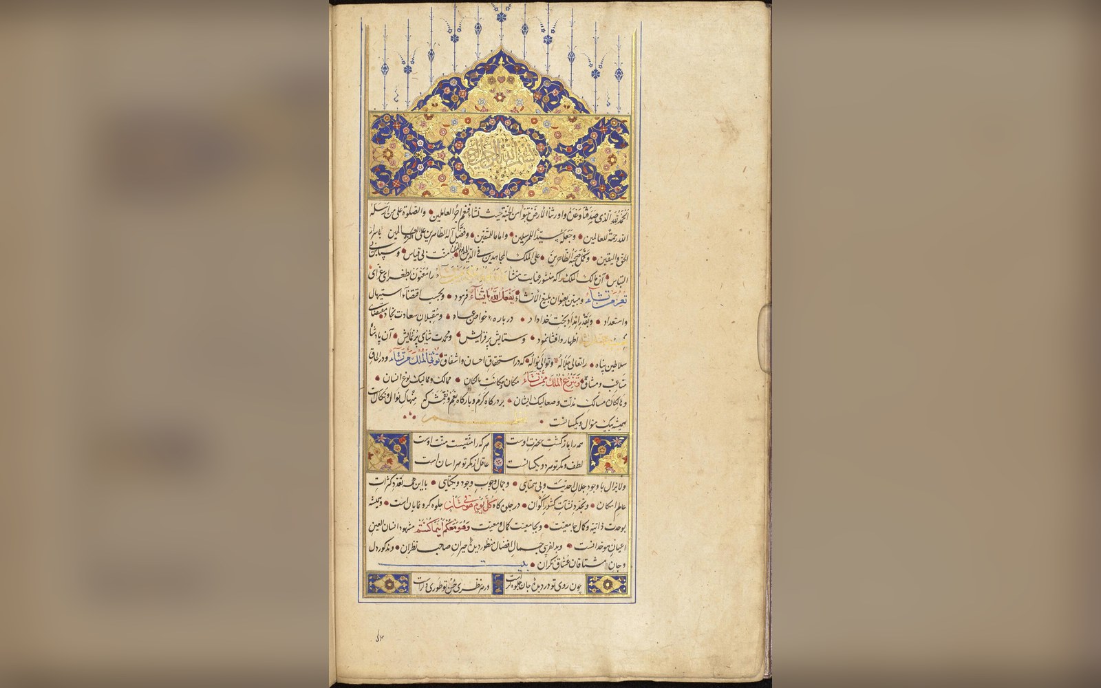 PL. V
PL. VThe white space you don't notice is doing the most work
A margin is not emptiness. It is where the reader holds the book without covering the text, where the eye lands between lines, and where centuries of accumulated practice about what a page should feel like are silently encoded.
Medieval scribes and early printers worked from a simple geometric principle: the text block should sit closer to the spine and higher on the page than it sits to the fore-edge and the foot. The result, often described as the canon of page construction, places the inner margin smallest, the top somewhat wider, the outer wider still, and the foot widest of all. When two pages lie open together, the two inner margins read as a single gutter — visually narrow, which gives the spread its sense of a centred, stable field of text.
The outer margin is wider than the inner one because it is where the thumb goes. Grip a book by its outer edge and your fingers cover whatever sits there; printers knew this long before ergonomics was a word. It also offers the eye a resting place — a blank lane the gaze skims along when scanning down the page, separating this column of words from whatever is outside the book entirely.
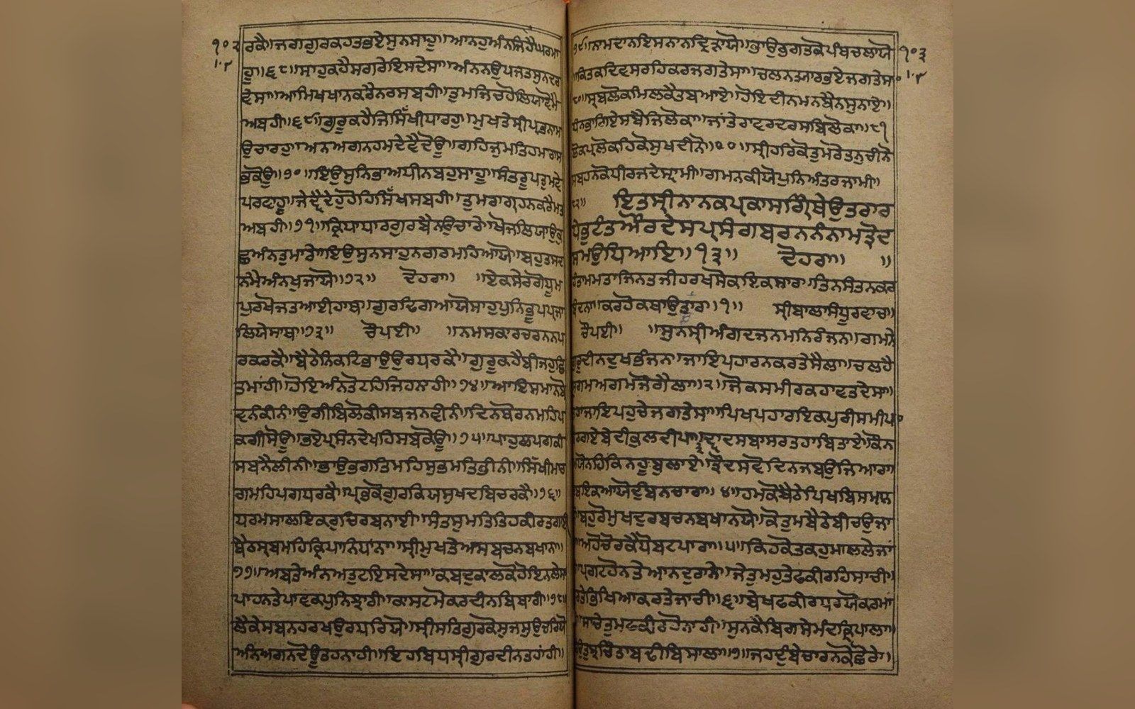
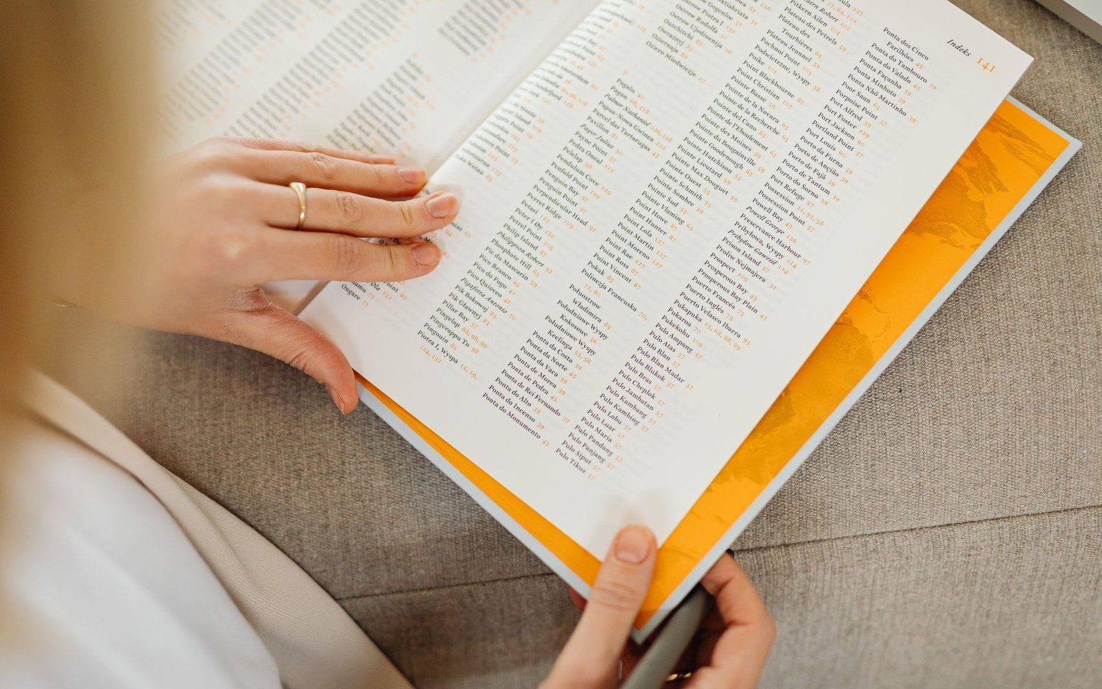
The foot margin is widest of all precisely because pages that bleed text to their lower edge feel cramped and unfinished. The foot acts as a visual base, grounding the block the way a plinth grounds a column. Running heads and page numbers — the apparatus of navigation that developed across the hand-press centuries — occupy the head margin without visually disturbing the text, because that margin is already accounted for in the design.
Shrink the margins and you cut the cost: fewer sheets, lower paper bills. Publishers under commercial pressure have always done it, and readers have always felt the difference without necessarily naming it. A page that feels airless usually has outer and foot margins that have been quietly robbed. The mathematics of proportion did not change; the economics simply overrode them.
From the record
Key terms
- inner margin
the margin closest to the spine; the narrowest in a proportioned layout
- fore-edge
the outer edge of the page, opposite the spine
- gutter
the combined inner margins of a two-page spread
- text block
the area of the page occupied by type, defined by all four margins
- foot margin
the margin at the bottom of the page; traditionally the widest single margin