Formats · Entry A
The Aldine octavo
Aldus Manutius put classical texts into pocket format in Venice in 1501 and had Francesco Griffo cut an italic to fit more words on a smaller page — portability as an editorial decision.
- Section
- I · Formats
- Mark
- Signature A
- Filed by
- Folio to octavo, and what the fold decides.
- Next
- Folio, quarto, octavo
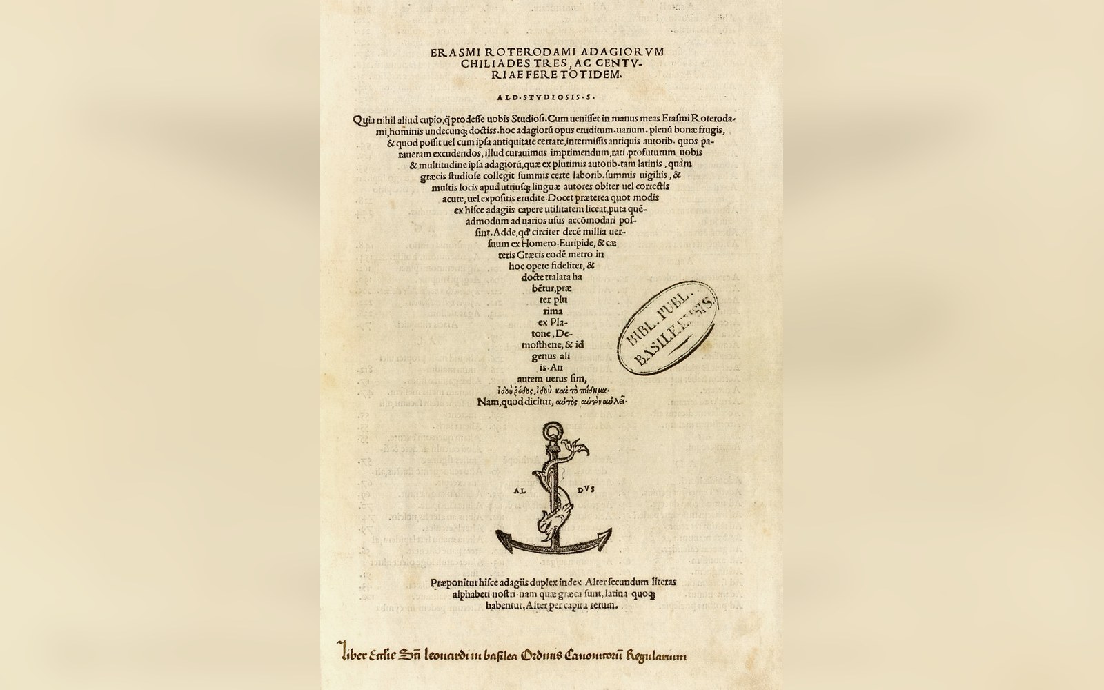 PL. A
PL. AA classical library you could carry
Before 1501, the serious reader who wanted Virgil owned a folio — a large, heavy, expensive object that sat on a lectern and stayed there. Aldus Manutius changed that in a single editorial decision: he put the Latin classics into a format you could slip into a coat pocket, priced them for a travelling scholar rather than an institution, and in doing so invented a new relationship between a reader and a text.
The format was the octavo, produced by folding a sheet of paper three times to yield eight leaves and sixteen pages. Smaller formats had existed, but the octavo was the one Aldus chose to systematise, and the association of the octavo with portable, affordable reading persists so directly from his 1501 programme that folio, quarto, octavo are still sometimes discussed in terms of the hierarchy he established. The folio was monumental; the quarto was scholarly; the octavo was the reader's book.
The first title in the series was Virgil, issued in April 1501 by the Aldine Press in Venice. Over the following years Aldus followed with Horace, Ovid, Dante, Petrarch, and a run of Greek prose texts. The intention was explicit and commercial: to give educated readers — humanists, scholars, students, merchants with literary tastes — a portable classical library at a price that made accumulation possible. The books sold across Europe, carried by the same trade routes that moved Venice's other exports.
The type was the argument
An octavo page is small. Fitting a complete text of Virgil onto pages of that size without either shrinking the type to illegibility or multiplying the number of sheets (and therefore the price) required a new kind of letterform. Aldus commissioned Francesco Griffo, a goldsmith and punch-cutter from Bologna working in Venice, to cut a typeface based on the informal humanist cursive handwriting used by Italian scribes — a sloped, condensed form that packed more characters per line than the upright roman that preceded it.
This was italic type, and it was cut specifically to solve a format problem.
The condensed letterforms meant that a given text occupied fewer lines, fewer pages, fewer sheets of paper. Since paper and price were directly linked — paper was the dominant material cost in any book — Griffo's italic was not merely aesthetic. It was economic. A page set in italic held appreciably more text than the same-size page set in roman, and the Aldine volumes held together at a price point that made their novelty viable.

The italic used in the early Aldine octavos was not paired with a roman for emphasis in the modern manner; it was the text face, used for the entire body of the book. Roman type appeared only for headings and preliminary matter. The now-standard convention — roman body, italic for emphasis or titles — developed later, as other printers adopted Griffo's forms and adapted them to different needs. Griffo's original cutting was widely admired and widely pirated, most notably by presses in Lyon, whose copies circulated through France and beyond within a decade of the first Virgil.
Aldus attempted to protect his designs through papal and Venetian privileges, the nearest available instrument to a typographic copyright, but enforcement was limited and the italic belonged to European printing generally within a generation.
Format, price, and the edition as object
The Aldine octavos were not cheap by the standard of a craftsman's daily wage, but they were dramatically cheaper than the large-format manuscripts and printed folios they displaced. Their price made them buyable rather than merely consultable, and that distinction drove a change in how readers related to text.
A book you own and carry is annotated differently from a book you visit. Marginalia in surviving Aldine copies range from humanist commentary to reading notes to simple marks of ownership — evidence of readers working privately with texts that had previously required institutional access.
The physical format reinforced this intimacy. The gatherings — folded signatures of paper sewn through the fold — produced a book that opened well and stayed open. The page dimensions, typically around 15 by 10 centimetres, were scaled to a hand rather than a lectern. Running heads gave the reader orientation in a small, dense page.
From the record
Key dimensions and dates
- 01Format: octavo, produced by folding a sheet three times to yield eight leaves, sixteen pages
- 02First Aldine octavo: Virgil, issued April 1501, Venice
- 03Typical page size of Aldine octavos: approximately 15 × 10 cm
- 04Punch-cutter: Francesco Griffo, originally from Bologna
- 05The italic was cut specifically to condense text onto a smaller, cheaper page — not as a display or decorative face
- 06Aldus used papal and Venetian privileges as the nearest equivalent to typographic copyright
The absence of elaborate woodcut borders or decorative initials, which the larger formats of the period carried as signals of prestige, left the Aldine page spare and functional — closer in spirit to the working manuscript than to the decorated presentation book.
Aldus also introduced the anchor-and-dolphin device, printed on the title page of many Aldine volumes, as a mark of authenticity against the copying presses. It became one of the earliest recognisable publisher's marks in the European book trade, a visual assurance to the buyer that they held the authorised text. Whether the mark reliably distinguished genuine Aldine printing from the best Lyon imitations was another matter, and bibliographers still distinguish carefully between Aldine originals and continental copies when cataloguing the period.
The long consequence
The Aldine octavo did not remain a Venetian speciality for long. By the middle of the sixteenth century, the format had been adopted across the European printing trade as the standard vehicle for literary and scholarly texts intended for individual ownership. The folio retained its authority for law, theology, and reference works that needed to be consulted in place; the octavo became the format of choice for texts meant to be read through. That division of labour between format and use has never entirely disappeared.
When, centuries later, Allen Lane designed the first Penguin paperbacks in 1935, he was solving a recognisably similar problem: a text worth reading, a format that made it portable and affordable, a price point that matched a specific social moment. The mechanics were different — perfect binding rather than sewn signatures, machine composition rather than hand-cut punches — but the editorial logic was continuous.
Portability is not a convenience feature added to a book after its real form has been decided. For Aldus in 1501, as for Lane in 1935, portability was the argument.
From the record
Vocabulary on the page
- italic
a sloped, condensed typeface cut by Griffo for the Aldine Press; in the original octavos it served as the body text, not as emphasis
- signature
a folded section of paper forming a unit of the book, sewn through the fold
- running head
a line at the top of a page giving the reader orientation; present in Aldine volumes
- privilege
the early-modern instrument used by Aldus to restrict copying of his typeface designs; precursor to copyright
The italic that Griffo cut for the first Aldine Virgil survived its immediate commercial context by several centuries. Refined by Claude Garamond and others in the decades that followed, the humanist italic became the foundation of the western typographic tradition for text-in-motion: commentary, translation, the aside, the foreign phrase. That lineage runs from a goldsmith's punches in a Venetian workshop to the italics on this page.