The Page · Entry U
Measure
Line length decides how easily the eye finds the next line, which is what a margin is actually for.
- Section
- VII · The Page
- Mark
- Signature U
- Filed by
- Margins, spacing and the eye.
- Next
- Word spacing
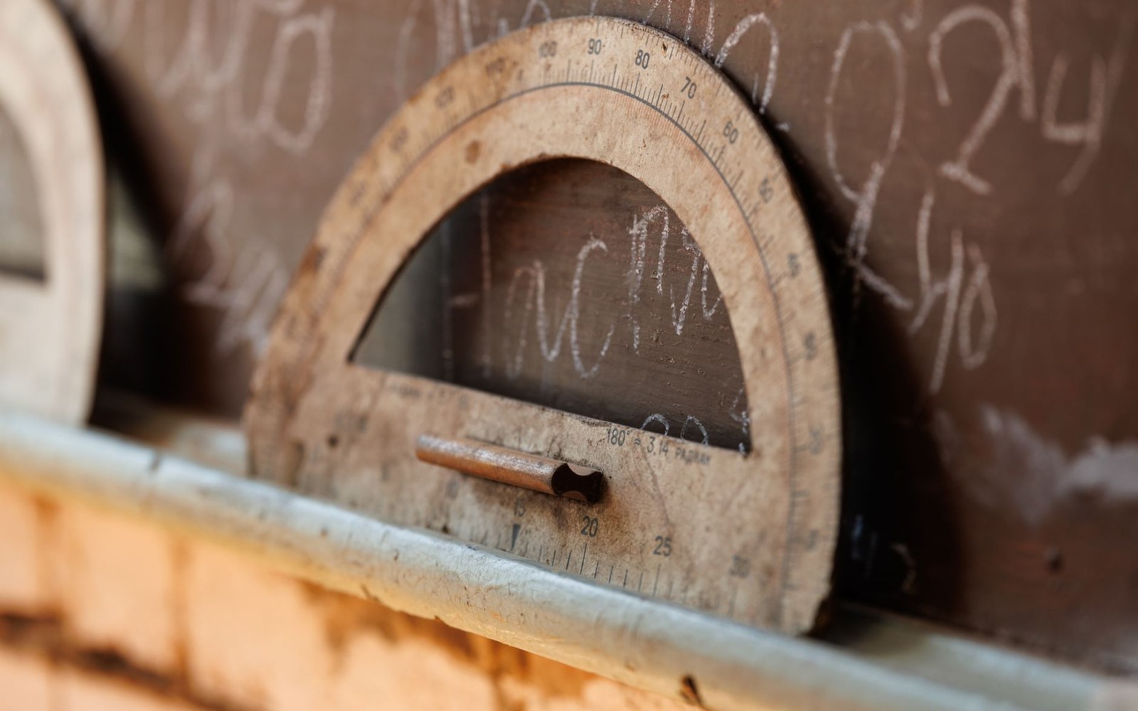 PL. U
PL. UThe line that tells your eye where to go next
The width of a column of type — its measure — is one of the least visible decisions in book design, and one of the most consequential. Get it wrong and readers tire without knowing why. Get it right and the text seems to carry them forward on its own.
What the eye is actually doing
Reading is not a smooth leftward-to-rightward sweep. The eye moves in rapid jumps called saccades, pausing briefly at clusters of words before leaping again. At the end of each line it must make a return sweep — back to the left margin, down one line — and land accurately on the new line's opening word. That return is where measure does its work.
A line that is too short forces constant returns before the brain has time to absorb a meaningful unit of text. A line that is too long demands a return sweep across so much white space that the eye frequently drops to the wrong line, or loses its place entirely. The result in both cases is fatigue: not dramatic, not noticed as a defect, simply a book that feels harder to read than it ought to.
Typographers have long settled on a range — roughly forty-five to seventy-five characters, counting spaces, per line as workable for a single-column page of continuous prose. The number is not a law, but it reflects the geometry of the return sweep and the way short-term visual memory holds a line as a unit.
How the measure is set
Measure is expressed in the old typographic unit of picas (one pica is approximately a sixth of an inch, or just over four millimetres), and it is fixed by the intersection of three decisions: the physical page size, the type size, and the margins. Change any one of them and the measure shifts.
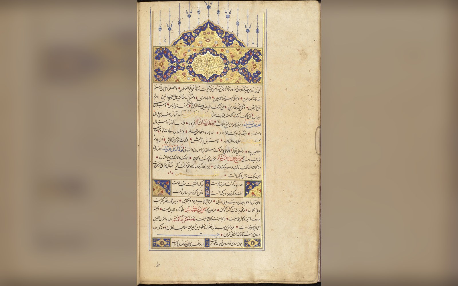
Folio, quarto, and octavo formats each present the typesetter with a different physical column to fill. A folio page is wide enough that a single full-width column would be unreadably long; it demands either double columns or generous margins that bring the type block in. An octavo page — the workaday format of the nineteenth-century novel — naturally falls into a measure that suits prose at eleven or twelve point. That is part of why the octavo endured.
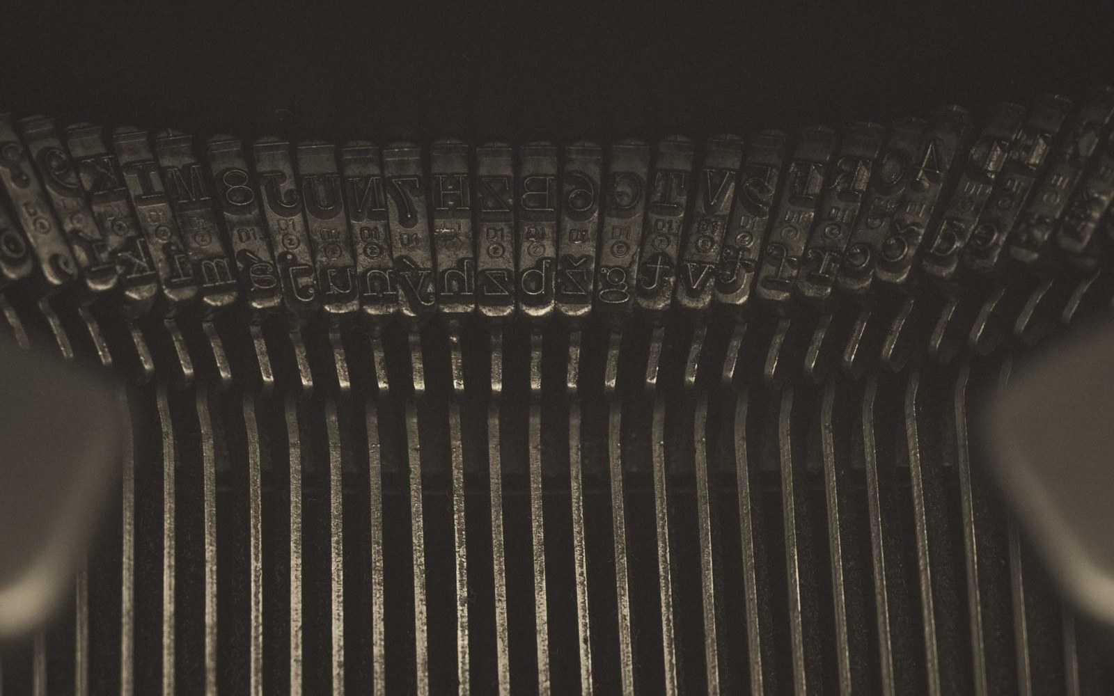
The relationship between type size and line length matters equally. A larger type needs a wider measure because the physical reach of each character is greater; compress it and the line holds too few words for meaning to cohere. When Jan Tschichold drew up his composition rules for Penguin in 1947, he was partly imposing this logic on a list that had become typographically unruly — different typefaces, different sizes, different measures — making each title feel like a separate design decision rather than part of a coherent series.
The margin is a consequence, not a decoration
Here is the part that is often misunderstood: the margin does not exist to frame the page, or to accommodate annotations, or because white space looks elegant. The margin exists to set the measure. Once a typographer has decided that eleven-point Bembo needs sixty-five characters per line to work properly, the margins on a given trim size follow as arithmetic. They are the residue of a line-length decision.
This is why the outer margin of a traditionally proportioned page is the widest, and the inner margin (the gutter) the narrowest. The outer margin is where the eye works at the edge of the page, and on versos it is where the return sweep lands — the eye needs generous space there to locate the line start cleanly. A cramped outer margin is not merely stingy; it is, in a practical sense, harder to read.
From the record
The numbers behind the rule
The apparent simplicity of a printed page — white space, type, more white space — conceals a precise chain of decisions about human perception. Measure is where those decisions begin.