Composition · Entry P
The Penguin Composition Rules
Jan Tschichold imposed a single typographic standard on an entire list in 1947.
- Section
- V · Composition
- Mark
- Signature P
- Filed by
- Setting the type.
- Next
- Hand setting
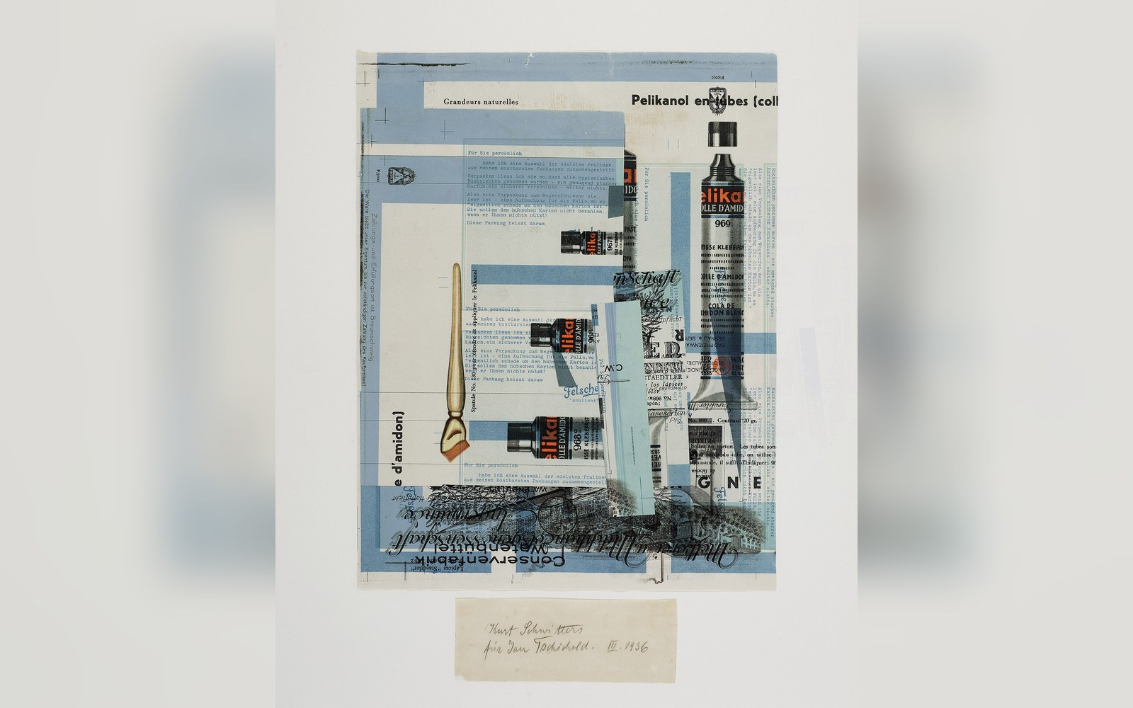 PL. P
PL. PHow one typographer brought order to a chaotic list
In 1947, Jan Tschichold arrived at Penguin Books in London with a brief that was both simple and sweeping: make every book look like it had been set by the same considered hand. What he produced — a four-page document distributed to every compositor and printer working for Penguin — became one of the most influential pieces of applied typography in twentieth-century publishing.
Tschichold had already moved, by then, from the rigid asymmetry of his early modernist manifesto Die neue Typographie toward a warmer classicism. His Penguin Composition Rules reflected that turn. They specified, in plain numbered clauses, exactly how type was to be set: word spacing was to be one-third of an em, never the fat, irregular gaps that were common practice in hot metal composition; sentences were not to be separated by double spaces; punctuation following italic text was to revert to roman; and so on through some dozen points of fine but consequential detail.
The rules addressed the measure — the line length — and the handling of running heads, chapter openings, and title pages. Tschichold also redesigned the Penguin and Pelican cover grids during the same period, but the Composition Rules were specifically about the interior: the texture of the page, the thing a reader encounters sentence by sentence without knowing why it feels right or wrong.
The practical authority of the document derived from its clarity. Tschichold was not issuing aesthetic preferences — he was issuing instructions, and the instructions went to the compositors at outside printing houses who actually set the type. Penguin was not a printer; it commissioned production across multiple firms, and without a common standard each house introduced its own habits. The Rules closed that gap.
Tschichold left Penguin in 1949, but the Composition Rules outlasted him, remaining in use — with revisions — for decades. Their legacy is really a lesson in how typographic standards travel: not through a designer's presence but through a document precise enough that a compositor who never met Tschichold could nonetheless set a page he would have passed.
From the record
Key terms
- em
the square of the type size; the unit in which word spacing is expressed
- roman / italic
the upright and slanted cuts of a typeface, which interact in punctuation practice
- compositor
the typesetter who assembles lines of type, whether by hand or by machine