Price · Entry K
Ten titles at sixpence
Allen Lane priced the first ten Penguins in 1935 at the cost of a packet of cigarettes; the first was André Maurois's Ariel.
- Section
- IV · Price
- Mark
- Signature K
- Filed by
- What a book cost, and to whom.
- Next
- What a book cost
 PL. K
PL. KHow Allen Lane set a price point in 1935 that redrew the map of who could own a book
The arithmetic of a packet of cigarettes
When Penguin Books launched in July 1935, Allen Lane's ten inaugural titles each cost sixpence — exactly the price of a packet of ten cigarettes, as Lane himself was fond of pointing out. The comparison was deliberate. It placed the paperback not against the hardback novel, which might run to seven or eight shillings, but against a disposable daily pleasure. The question Lane was really asking was not "can you afford a book?" but "do you already spend this much without thinking?"
The ten titles were a considered mix of biography, fiction, and reportage, chosen to signal range rather than lowbrow safety. The first was André Maurois's Ariel, a life of Shelley first published in French in 1923 and already well known in English translation. The others included Agatha Christie, Ernest Hemingway, and Dorothy L. Sayers — names recognisable enough to reassure a buyer who wasn't sure a sixpenny paperback could be worth the time.
Why sixpence was structurally radical
The price only makes sense against the landscape it disrupted. The dominant retail format for new fiction was still the three-decker — or, by the 1930s, its single-volume descendant at around seven shillings and sixpence. Mudie's Select Library had spent decades keeping that price high by buying in bulk and lending rather than selling; when Mudie's Select Library finally collapsed in 1937, it was into a market Penguin had already begun to rearrange.

Lane's sixpence was not a discount on a premium product. It was a claim that the economics of publishing had been wrong about who books were for.
To hit sixpence, Lane needed volume, and volume required a new kind of distribution. The famous story — that the Woolworths buyer's wife agreed to a trial order in a railway-station café, and Penguin then supplied the chain — points to the mechanism: books sold alongside toothpaste and tinned goods, not shelved in specialist shops that many buyers found intimidating. The unit cost only worked if print runs were large, which meant that titles had to sell rather than sit.
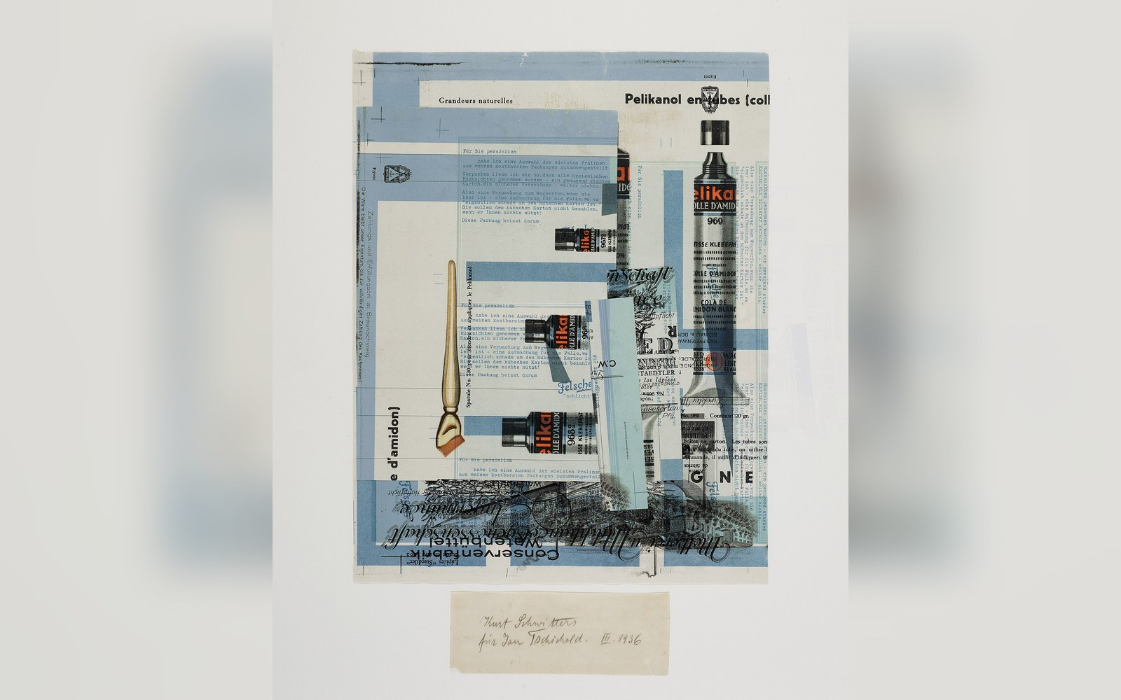
The physical object was lean accordingly. Penguin's early covers used three horizontal bands — colour-coded by genre, orange for fiction — with a cartouche at the centre and minimal decoration. Jan Tschichold would later systematise Penguin's typography in his famous Penguin Composition Rules of 1947, but in 1935 the design was already disciplined by budget: no illustrated boards, no excess ink, no dust jacket. Paper and printing had to absorb most of the sixpence, leaving almost nothing for elaboration. What looked like aesthetic restraint was also a cost sheet.
From the record
The first ten, in context
- Ariel* (André Maurois)
biography of Shelley; the lead title
- Genre colour-coding
orange for fiction, green for crime, blue for biography; the bands were the catalogue in miniature
- Sixpence in 1935
approximately equivalent to a packet of ten cigarettes at the same date; the comparison was Lane's own framing
The binding was perfect binding — pages glued rather than sewn — which was faster and cheaper than sewn and cased hardback production, and which accepted, as a structural fact, that these books might not last. A sixpenny paperback was not supposed to be passed to grandchildren. It was supposed to be read on a train, left at a friend's house, or bought again. The economics of disposability and the economics of accessibility turned out to be the same economics.
What the price point proved
Lane's gamble worked because he was right about latent demand. Readers existed who were shut out not by indifference but by price; the fifteenfold gap between a Penguin and a new hardback was the wall, and sixpence cleared it. Within months of the launch, reprints were running. By the end of 1935 Penguin had sold over a million copies across the list.
The cigarette comparison, repeated often enough to become legend, was more than a marketing line. It named the real competitor for a working reader's small change, and it won. A book that cost what you already spent on nothing much was no longer a luxury. That was the argument, stated in price before it was ever stated in words.
From the record
What the price required
- Print runs large enough to absorb low unit margin
distribution through Woolworths and W H Smith, not bookshops alone
- Perfect binding rather than sewn signatures
faster, cheaper, structurally committed to a shorter lifespan
- No illustrated boards, no dust jacket
design discipline enforced by the cost sheet as much as by aesthetic choice